$30M+ In Revenue
Zwift Hub Sales
80,000 Account Migrations
Zwift Annual Memberships
4x Conversion
Zwift Referrals Program
Details
Industry:
Connected Fitness (Cycling)
Work Performed:
Competitive Research
User Journeys
UX Design
Prototyping
User Testing
UI Design
Page Layouts
Content Design
Tools:
Figma
Miro
Usertesting.com
Situation
At the time this project started, Zwift's onboarding process was so difficult that employees referred to it was "crawling through broken glass". Zwift, as a connected cycling product, is difficult for prospects to understand and requires education about technical terms such as FTP (Functional Threshold Power - how much power a cyclist can maintain over specific time periods) to get the most out of the platform.
In addition, setting up a bike for Zwifting requires mechanical knowledge. At the time I began work on improving Zwift.com almost all onboarding knowledge was tribal - meaning the only way to get set up on the platform was through the help of existing users. There were no 1st party trainers (the device a bike attaches to for Zwifting), and only a single monthly subscription product. For prospects looking at a significant cash outlay to get started, it was clear that Zwift needed a friendlier, friction-free process to get people riding.
Thus, I started by working on user journeys to sell the Hub, Zwift's premier 1st-party cycling trainer. I started by researching competitors (Wahoo, TacX, Elite Trainers) to see how other companies positioned their products. One of the goals of the Hub was to force down the price of trainers across the market, so it was crucial to discern how other companies priced and marketed their trainers.
With competitive research done, I moved on to building out the user journey for Hub sales. This included pre-order notifications to alert prospects when the Hub became available for sales. With the general flows in place I began the process of layout for the Hub sales page, adding in significant amounts of content design to ensure prospects felt educated and comfortable with the purchase process.

Zwift Hub: Home / Landing Page / Setup Page Flow
As part of making the Zwift Hub more friendly, I moved the setup walkthrough out of the support site and made it part of the Hub user flow. This had several positive benefits: Users traditionally had been intimidated by the support site; so sharing high-quality setup videos as part of the user flow was much more accessible; it also helped with SEO as the setup content was part of the same domain as the Hub sales page. With all these pieces in place, sales of the Hub began, resulting in a significant positive impact for both revenue and user perception of Zwift.
$30M+ In Revenue
Zwift Hub Sales
9 Months
From Idea to Launch
Market Impact
Drove Trainer Prices Down
Moving on to Referrals
With the Hub finally launched, I next took on a relatively short project with an outsized impact: Referrals. We tackled this feature by generating a custom referral URL for each existing user. This is where I brought some customizations to the design - any prospect who clicks on a referral link would see a headline mentioning (by name) the Zwifter who invited them. This helped build a narrative around the referral process and increase conversion - as mentioned earlier, users who subscribed via referral had a 4x retention rate compared to standard subscribers.

Zwift Referrals: Prospect Landing Page, User Referral Page, Welcome to Zwift Page
Results from Referrals
1000+ New Subscribers
In the First Year
4x Conversion
Compared to Standard Prospects
12% Less Cancellations
Over Standard Subscribers
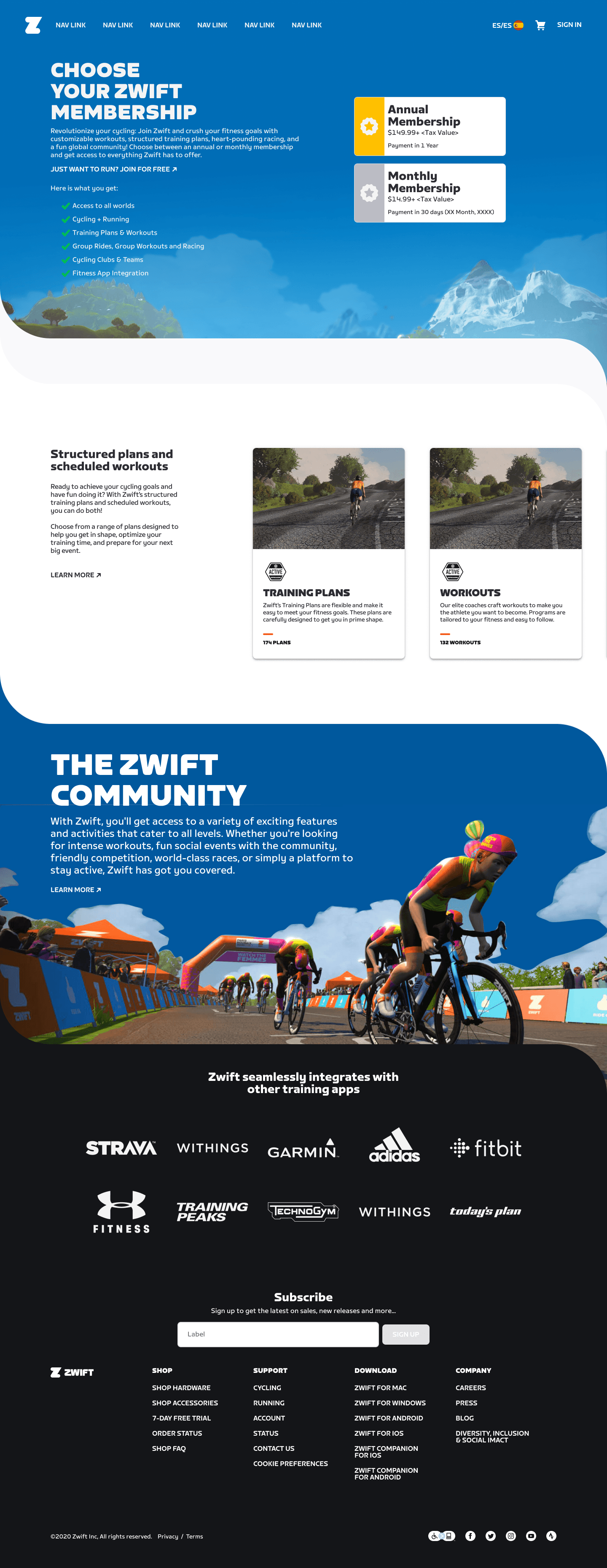
After launching Referrals, I then moved on to designing the user journey for Annual Plans. Users who opted to subscribe annually would get 2 months free each year - this included new users, existing users and lapsed users who had canceled and not resubscribed. This meant developing 3 unique flows for each user type, and creating a "Membership Card" in the user profile that helped users understand their subscription status.
After initial designs were done, we tested this flow and received generally positive feedback - although users also raised some issues with the flow. We fixed the UX issues, retested and then collaborated with the marketing team to ensure this new membership flow dovetailed with marketing efforts around this new product.
Initial projections for Annual Plans were for about 20k users to migrate initially, but due to the success of the flow we saw about 4x that number - 80k users - move to Annual Plans, resulting in significant revenue generation immediately after launch.

Annual Plans: Plan Selector Page for Prospects, Plan Selector for Existing User, Marketing Promotion for Annual Plan
80k Migrations
In the First Month
2.5x Migrations
Over Projections
10% of New Users
Chose Annual Plan